Thứ Hai, 18 tháng 8, 2008

Drawing Made Easy

This book taught me how to draw. I relied on books because I never had a drawing teacher (except my older brother) until I was in my early 20s. I searched for the books on drawing that I could find. This was the one that helped me the most. And as I look at it again, I still think it’s one of the best.
The method was simple. Draw a simple outside shape first and keep that shape in mind as you subdivide the big shape into smaller details and shading. The shape is made of straight lines that enclose the form in a kind of envelope.

Although Drawing Made Easy was intended for children, the method is virtually identical to the way drawing was taught a hundred and fifty years ago in the French Academy. Charles Bargue’s drawing course (below) uses the same basic idea.

When I was still in grade school I ran across another book called The Natural Way to Draw, by Kimon Nicolaides. I was attracted to this book because it offered a serious regimen for teaching yourself drawing. And it introduced two simple-to-understand but contrasting methods: contour drawing and gesture drawing.

I diligently tried both of the methods that Nicolaides recommended. But I wasn’t happy with the results. My contour drawings came out terribly because by moving my eye like an ant on one small part of the pose, I lost track of the whole. My gesture drawings came out too unfocused and sloppy. Maybe I was doing something wrong. But my feeling was that this was the unnatural way to draw.

Although I couldn’t have articulated this when I was eight years old, I had a sense that the contour drawing idea was unhelpful because drawing is more a process of interpolation than extrapolation, of subdivision rather than extension. To put it another way, drawing is a hierarchy of successive approximations from large shapes to small shapes.

In the first steps of making a drawing, broad estimations of length and slope and shape give way to progressively smaller estimations. Those smaller measurements are always made with the original large view in mind. Turning that method on its head may give a momentary experience of an artist’s way of seeing, but, for me at least, it didn’t lead to good drawings.

And gesture drawing was not useful for me because drawing is neither all loose nor all tight. Drawing blends freedom and control at every stage.

I think I would have loved Betty Edwards’ book Drawing on the Right Side of the Brain if it had been available when I was in elementary and junior high school. She successfully reintroduces some of Nicolaides’ methods (and many other ideas) by interpreting the experience of drawing from the standpoint of modern cognitive science.

There’s no single way to draw, and no single way to teach drawing. But a lot of art teachers in the 1950s and 60s threw out the common-sense method of books like Drawing Made Easy in favor of other methods that were supposed to enhance expression. The big-shape analysis offered by Drawing Made Easy may not make drawing easier, but it yields results, both for imaginative and observational drawing.

Maybe our friends over at Dover Publications will consider bringing D.M.E. back into print.
-------------
Note: There's a current book series called Drawing Made Easy: Discover Your Inner Artist that has nothing to do with the original book from almost a ninety years ago.

E.G. Lutz also wrote about about animation that influenced Walt Disney, link.

Drawing on the Right Side of the Brain website, link.

Charles Bargue illustration courtesy the blog Learning to See, which has a nice post about his method, link.

ADDENDUM: Blog reader Patty has shared this link to an online book called "Practical Drawing" by E.G. Lutz which shows his methods presented to adult readers, link. Thanks, Patty!

Chủ Nhật, 17 tháng 8, 2008

Color in Vermont

How much do we love color? From late September to early October, nearly four million people visit Vermont to see the color of the fall foliage. The favorite trees are maples, oaks, and birches. The number of visitors is almost seven times the state’s population. They spend almost a billion dollars.
-------
Plein air painting was from River Road in Rhinebeck in mid-October.
The numbers are from Idyll Banter by Chris Bohjalian, link.

Thứ Bảy, 16 tháng 8, 2008

Getting a Fresh Eye

When I work on a painting I literally get too close to it, and I grow accustomed to its faults. There are at least six ways to get a fresh eye on a work in progress.

1. Turn it upside down and look at it (or work on it) inverted. I spend about one-fourth of my painting time working on my fantasy paintings inverted, either to see them objectively or to get a better angle on the strokes and perspective lines.

2. Step back from it, squinting and tilting your head.

3. Use a reducing glass—a double concave lens that will make your full composition fit handily into the palm of your hand.

4. Shoot a digital photo of the painting and look at it in the LCD, flip it 180 degrees or process it in Photoshop to see how it works in two values.

5. Set up an adjustable mirror on the wall behind and above your shoulder (see above). Mine is mounted on a wall bracket with an adjustable ball in socket joint. Making the painting both smaller and reversed will help you spot problems right away.

6. Ask a trusted friend, family member, or visitor to take a look at it. They don’t have to be an art expert. What interests me most about someone’s reaction to my picture is what strikes them first, what they notice most. It’s not always what I was intending.

Thứ Năm, 14 tháng 8, 2008

Scrap File

In most fantasy or science fiction scenes, some elements are completely invented, but the majority of elements are no different from what we see around us every day. You can draw upon existing photos as source material for these effects whenever you need real-world texture in your picture.

Here’s the art for a paperback cover called Homecoming by John Dalmas. His novel, the sequel to Yngling, was set on a barbaric post-plague Earth. This scene shows neoviking horsemen challenging a low-flying spacecraft.

Of course I had to come up with the spacecraft design by sketching a lot of doodles like this out of my head.

Even though this is an imaginary scene, the sky presents the same kinds of clouds and light as it would today. Grass and dirt would have looked the same in this world as it would for the rest of us. Horses in all sorts of poses, armor, trees, stormy skies—all these effects can be adapted and inspired by existing photos.

At Art Center where I went to school, this was called "scrap," by others call it "clip art," "swipe," "morgue," or just "reference."

Existing photos are of great value for such visual details. You can get the photos from anywhere. I like to fish old magazines out of the bin at the recycling center or pick them up at yard sales. Nature magazine, old National Geographics, and architectural magazines are all treasure troves for light, color, and surface texture. Magazines of food and cuisine often have photos with interesting color schemes that can be turned upside down and used purely for their component colors.

I flip through stacks of magazines and blade out the photos that strike me as interesting. I also include photos that I’ve taken myself, particularly of things like stones and roots that are hard to find in magazine photos. I also have some individual drawings of zoo animals and other forms mixed in the file folders with the photos.

The images are stored in legal size manila folders inside a pair of strong filing cabinets. The folders include categories for particular forms like animals, architecture, and vehicles, but also more subjective categories like light conditions, color schemes, atmospheric conditions, and photograhic effects. The “people” category alone has 54 separate folders, including “Poses: pointing” and “Groupings: parades,” for example. You should divide your file according to the categories that are important to you.

Of course you may want to use the Web for finding your images. Internet-sourced images are really helpful, but consider the advantages of a traditional scrap file:

1. When you do a Google search for, say, “mountain stream,” you and everyone else get the same 50 photos first; in your own scrap file, you’ll have images no one else does.
2. Clipped photos are cheaper, better color, and higher resolution than images you print out from the Web or from your own digital photos.
3. If you surround your painting with scrap images, the images will be in the same light as your painting, so you can compare the colors to your paint mixtures more accurately.
4. With paper photos, you can draw on many influences at once, taking a small influence from each one.

Turner Exhibition

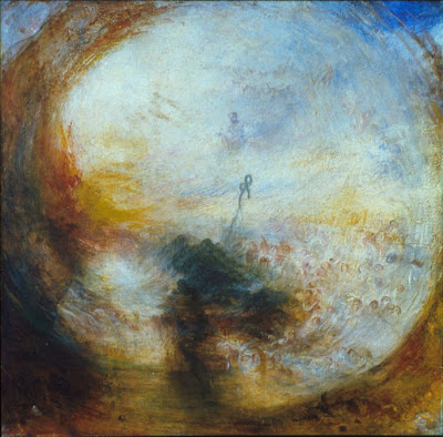
The curators who wrote the wall captions for the J.M.W. Turner exhibition (Metropolitan Museum, through Sept 21) ran out of words to describe Turner’s brand of imagination, because they used the word “Sublime” 14 times in within the first room alone.

Whatever word you want to use: sublime, awesome, dramatic, mind-blowing, soul-stirring, it’s a gigantic show, with over 140 watercolors and oils. The works of the first room showed Turner (1775-1851) at the full height of his powers. His shipwreck scene (above) from 1805 has more whirling energy than anyone else has crammed onto a single canvas.

His early watercolors and oils, like “Tintern Abbey” done when he was 17, have a precision of perspective and a control of value that make them a good example of a romantic spirit disciplined by controlled observation.

One of Turner’s gifts is the modulation of tones across large expanses of the composition. Instead of defining passages of architecture, clouds, or rock masses with sharp contrasts, he holds them to close value ranges. Contrary to the rule that the eye seeks out maximum contrast, these parts of the picture attract the eye more readily than other passages rendered in strong accents of black and white.

Strangely, though, his figure work never obeys the tonal rules he establishes for everything else. The figures are always a jumble of tone, spotty, and poorly conceived. Even in a historical painting like the Battle of Trafalgar (detail, above, and full composition inset below), where the figures are ostensibly the center of interest, they are awkwardly and embarrassingly drawn.

The painting seems to be divided into two different worlds: the sails and smoke, wreathed in magical vapors, and the figures, strewn about like boneless rag dolls on the doorstep of the scene.

Turner was at his best when his eyes were open. “Ivy Bridge, Devonshire” shows an appetite for the natural tangle of vegetation while at the same time giving equal attention to the surrounding light and vapor. His small watercolors from 1824 are sensitive and exquisite. The show includes a few very early plein air paintings from 1805, painted from a boat floating in the Thames.

As Turner’s career progresses, he grows more in love with light and atmosphere, and more indifferent to earthbound form. He maintains his sense of drama or the Sublime, but the more paintings you see together, the more his devices and tricks start to show. He falls into a conventionalism of color, composition, edges, and values.

In his painting of Venice, because of the cast shadows and the vertical streaks of reflections, the boats appear frozen in ice rather than sitting on water.

With the later work, it was as if a film began to cover his eyes. In “Ulysses Deriding Polyphemus” (1829), lauded by John Ruskin as his greatest work, the ship looks like a comical wedding cake. No one standing with us around the painting was entirely sure which smudge or cloud was supposed to be Polyphemus. It was like standing beside a goldfish pond looking for goldfish and not seeing any.

Yellow and red, he learned from Goethe, represent life and spirit, while blues stand for darkness and denial. In his attempt to rise to Goethe’s poetic conception, Turner began to use these colors in a more and more habitual way. A glance across any of the rooms in the second half of the exhibition revealed Turner’s fixed color template: warm lights and cool darks, never mind the truth of Nature.

In the final section, where he descends into pure abstraction, the limitations of his resources become even more apparent. One wall shows five paintings in a row with the same compositional formula: light at the center, dark around the edges, with a small spot of light in the foreground.

The conventional view of art history is that Turner in his later paintings entered a realm of pure light and atmosphere, setting the stage for the revelations of Impressionism. I wanted to follow him into his universe of mistiness, but I got stuck in the paint. And as much as I love light and vapor, I love the earth too much—trees and rocks and ships and buildings and people, none of which have a place in Turner’s later paintings.

The critics throughout his career complained of “indistinctness,” “negligence,” and “coarseness.” It’s hard to disagree with them. As much as I love Ruskin’s writing, his defense of Turner on the grounds of truth to nature is absurd and illogical.

In the end, Turner deserves credit for the raw power of his visual ideas. Rough, crude, or maddeningly vague as he may have been, he was a cyclone of visual energy, and his fundamental innovations are powerful and unforgettable. Later artists in the romantic tradition, like Frederic Church, Alphonse Mucha, Thomas Moran, and Ivan Aivazovsky (above), took Turner’s ideas and ran with them, making luminous, radiant statements without losing track of their love of material things.

In response to his critics, Turner said, “Atmosphere is my style.” But atmosphere without form is like music without notes or speech without words. It’s unintelligible, and therefore meaningless. Perhaps, as his contemporaries worried, he suffered from a touch of madness or perversity. Maybe he imbibed too much lead white. As one visitor wrote in the guest book at the end of the exhibition: “What was this guy on?”

Thứ Tư, 13 tháng 8, 2008

ABC High Pitched

It’s Wednesday. And that means it’s time for “Art by Committee,” the game that stretches our visualization muscles. Your assignment was to come up with a picture to go with this quote that I snipped out of an actual science fiction manuscript: “Their voices were high-pitched, piercing…but human.”

These solutions were so good that they practically shattered all the windows and wine glasses in our house.


And the one from the original sketchbook, drawn by a bunch of artists at a restaurant.

Next week’s quote is: “The man spasmed against the snow. 'Gods, no! No! No sorcery'—'Hold him,' I said calmly, as he tried to leap up and run."
Have fun! Please scale your JPG to 700 pixels across and please compress it as much as possible. Title it with your name, send it to: jgurneyart(at)yahoo.com, subject line ABC, and let me know in your email the URL of the link to your blog or website if you have one (even if you gave it to me before). Please have your entries in by next Tuesday at 10:00 AM Eastern Time USA.

Thứ Ba, 12 tháng 8, 2008

Silhouette, Part 2

Silhouettes don’t have to be black cutouts in side view seen against a white background. All shapes present silhouettes, and vision researchers have shown that one of the first tasks of perception is to be able to sort out the silhouette shapes of each of the elements in the scene.

A good rule of thumb is that the most important part of the pose, often the hands or the face, should be brought into the silhouette, rather than embedded inside the pose. In the painting "Forge of Vulcan" by Velasquez, the sun-god Apollo has arrived at the Cyclops' forge to break some bad news to Vulcan. The artist has made sure to bring Apollo's upraised finger into the silhouette to make it clear that he is relating a narrative.

Silhouettes can have dramatic, unexpected shapes, like the wind-blown cape of the pirate Billy Bones by N.C. Wyeth. Only the hat, the tip of the elbow, and the end of the spyglass break the outside shape, literally concealing the hand of the pirate, and making his intentions seem more mysterious.

Try to imagine the poses of your important figures converted into a simple silhouette, either black against white or white against black. If the shape standing alone still conveys the action, it will probably work fully painted, too.

The most important element of the pose should be placed with the strongest contrast against the background. The background can be designed so that it gradates up to a bright halo behind that element, while the other parts of the silhouette can be left a bit closer in value. In this N.C. Wyeth painting, the head is the featured part of the silhouette.

In this little sketch of a fellow artist that I did during a figure group, I chose to lighten the background behind her hand, rather than behind her head, because I thought it was more important.

Related posts: Edge Induction, link. Flagging the Head, link.

Thứ Hai, 11 tháng 8, 2008

Silhouette, Part 1

The silhouette is the outside shape of an object against the background, especially when it is filled in with a solid color.

Here, for example, is an illustration by Barbara Bradley turned into a silhouette. The silhouette by itself still communicates the idea of a girl beside a chair holding up a piece of cloth.


Here's the illustration in full color.
The silhouette helps us to immediately recognize animals, plants, or figures. It's a great way to sketch, and you can do it conveniently with a black brushpen. These are some sketches I did of tree silhouettes in southern California.

The silhouette conveys essential information about the mood and action of the pose. By carefully considering the silhouette, you can give your design more impact.

A face in profile is a common kind of silhouette. In the old days you could get a cheap portrait cut from black paper by a skilled artist.

The character Uncle Doodle is shown as he appeared in Dinotopia: The World Beneath.

Here is the same figure converted to a black silhouette. The whole pose, including the face and both hands, is clear enough from the silhouette alone. This kind of broad comic posing suggests pantomime stage acting from the Vaudeville era, and was popular with golden age American Illustrators, especially Maxfield Parrish, J.C. Leyendecker, and Norman Rockwell.
----------
Thanks Leif Peng for the Bradley, link.
Tomorrow: More on silhouette

Chủ Nhật, 10 tháng 8, 2008

The Hudson River School for Landscape

A group of over 30 landscape painters has been working for almost a month in Hunter, New York, in the heart of the Catskill Mountains. They’re participating in the second annual Hudson River School for Landscape, founded by Jacob Collins, who is also renowned for his atelier called Grand Central Academy of Art in New York City.

Travis Schlaht produced this painting of the Stream at Kaaterskill Falls during last year’s five-week session.

The lodging and tuition are provided for free of charge thanks to a generous fellowship from the Catskill Mountain Foundation. Over a hundred people applied for the positions, and Jacob told me it was very difficult to make the selection. The participants are young and talented, and they hail from as far as Spain, Germany and Australia. “It’s a little intimidating, honestly,” Jacob told me, and I agree.

I joined the group for a day of painting (Jacob Collins at left and me at right), and I probably brought bad luck because a torrential downpour opened up as soon as we got going.

Scott Balfe switched to a sombrero and Army-issue poncho to head off the downpour.

Here's my 11x14 painting of Scott (sans sombrero) alongside Schoharie Creek, with Jacob’s dog Finney wading in the shallows.

Once a week or so, the group gathers with their work-in-progress. I joined them last Wednesday for a supper, and I gave a slide show about the working methods of the early plein-airists.

The artwork that the group exhibited included sensitively-observed close views of stream rocks and mossy trees in muted colors and controlled brushwork, though there were also some rapidly-painted sunsets.

The curriculum is modeled on the methods of Asher Durand, Frederic Church, Sanford Gifford and other pre-Impressionist painters, achieving a high level of finish in pencil and oil, mostly with multiple sittings. When they get home, the artists will develop a larger composition based on the studies. Use of photography for reference is discouraged.

I believe that this group will have a significant and lasting effect on the future of American—and perhaps international—landscape painting.

My own painting of “Artists along the Schoharie Creek,” along with two other plein-air studies, are currently being exhibited and offered for sale at Windham Fine Arts Gallery in Windham, New York.

---------
Hudson River School for Landscape home page, link.
Exhibition of last year’s class, link.
Three Gurney plein air paintings at Windham Fine Arts, link.
Jacob Collins home page, link.
Previous GJ post on painting with J. Collins, link.

Color Wheel Question

Blog reader Emily emailed me a question that I couldn’t answer, so she gave me permission to post it to the group mind.

"I was opening up a new file in Painter today and started thinking about that little color wheel it shows you - the standard computer color wheel with all the colors in the wheel and the brightness and darkness controlled by a slider on the side. I noticed that the blue and red seem to have the illusion of spokes of more intense color poking into the wheel and the teal, purple, and yellow appear to have light spokes poking out of the wheel. Only the green just looks nearly flat all the way across. If you desaturate the whole wheel, all the tones are perfectly even. Any idea why this is?"

Thứ Bảy, 9 tháng 8, 2008

Arthur Keller’s Portfolio

Arthur Keller (1866-1924) was an American illustrator who studied at the National Academy and the Munich Academy. In 1920 he gathered up his preliminary studies from the costumed model, photographed them on glass negatives, and produced two portfolios of 11x13 inch plates.

According to an Oct. 20, 1920 New York Times review, the portfolios were popular with art students and fellow illustrators because they gave “an opportunity for the public to know a competent illustrator in his moments of preparation, of direct and prompt notation, the salient features of his subject emphasized, a gesture, expression or pose given the importance it has to an artist concentrating his attention upon the significant elements of a composition.”
--------------
Related GJ post on working from costumed models, link.
Biography of Arthur Keller on Jim Vadeboncoeur's BPIB, link.
Thanks to Steven Kloepfer and Barry Klugerman